Marketscape™: Infographics
The Map Information tool allows you to obtain detailed information for the currently selected indicator for the geography of interest.
To select desired geography:
-
Right-click on geography and from the context menu select Map Information.
-
Select one of the following options displayed in the menu:
| Menu Option | Description |
|---|---|
| Geography | Displays value of the currently selected indicator, as well as other feature details including hierarchical listing of geographies. |
| Population Trend - Change by Race/Ethnicity | Creates an infographic chart showing the percentage change by Race/Ethnicity. |
| Life Stage by Race/Ethnicity | Creates an infographic chart showing the life stage distribution of different races/ethnicities. |
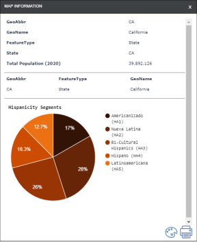
| Hispanicity Segments | Creates a pie chart showing the percentage distribution of the five Hispanicity Segments. |
| Asianicity Segments | Creates a pie chart showing the percentage distribution of the five Asianicity Segments. |
| Socio-Economic Status (SES) Segments | Creates a pie chart showing the percentage distribution of the five SES segments. |
| User Defined | Allows you to create and infographic based on desired indicators (see how below). |
Example of Infographics


Change Graph Colors
To change the colors used on the charts:
-
Click the Palette
 icon. The Chart Color Picker window displays.
 -
Select a color scheme.
-
Chart updates with new colors.
-
Color scheme is applied from right to left for pie charts and stacked bar graphs.
-
The middle color of the color scheme is used for horizontal bar charts.
-
User defined color selection does not persist and needs to be redefined when a new geography or chart is selected.
-
User Defined Infographic
A User Defined chart allows you to incorporate into the infographic your own list of indicators. This list of indicators needs to be defined via a Virtual Category. Click here to learn how to create a Virtual Category.
-
Right-click on geography and from the context menu select Map Information.
-
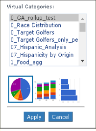
Select User Defined. The User Defined Chart window displays.

-
If you have no Virtual Categories defined, the system displays the following message: "A Virtual Category needs to be defined to create your own chart" Click here to learn how to create a Virtual Category.
-
Select the Virtual Category that contains the list of indicators for which you want to create a chart.
-
Select the type of chart and click Apply.
NOTE: Once you've selected a Virtual Category, it will be listed for you under User Defined for ease of reselection.